Brand, system and website for a safari operator in East Africa
Brand refresh, visual system and website redesign for a tailor-made safari operator in East Africa. We kept the logo concept, turned it into a system and reorganized the site so every visit can end in a trip inquiry.
Client
Tailor-made safari operator in East Africa
Brief
Brand, visual system and website
Year
2025
Status
Proposal delivered
Role
Brand direction, UX/UI and content
Disciplines
Brand · Visual system · UX/UI · Content
01 · The brief
A brand to keep and a website to reorganize
Around Africa Safaris runs private, tailor-made safaris in Uganda, Rwanda, Kenya, Tanzania and Burundi from its base in Kampala. It had strong selling points: local guides, its own fleet and five stars on Tripadvisor, with 346 reviews. Its website didn’t tell any of that. It was a WordPress site with sections that hadn’t been updated in years, outdated prices and no visible form to request a trip.
For the new website there was a starting landing page in Figma. Its visual language worked; the content didn’t. It promised online booking and a refund policy the company didn’t offer, pushed the trips down to 65% of the page and hid the reasons to book in text that only appeared on hover.
The brief had three parts: refresh the brand without losing what made it recognizable, organize it into a system that would work from the website to a business card, and rebuild the website so a first visit would end in an inquiry.
02 · The process
Five phases, from audit to interface
01
Audit
Inventory of the site and the landing page: what stays, what changes and what goes.
02
Brand
The refreshed logo: the same concept, better drawn.
03
System
Palette, typography, graphic device, voice and guidelines.
04
Architecture and content
Sitemap and one document per page with its purpose, its action and its copy.
05
Interface
Home page and Plan my trip, on desktop and mobile.
The brand and the architecture moved forward in parallel. By the time the first screen was designed, the palette, typography and copy were already locked.
03 · The audit
Twenty pages and eleven sections, reviewed one by one
Before designing, we reviewed the site’s 20 pages and the landing page’s 11 sections. Each section got a verdict and a specific change. The problems kept repeating: claims no one could verify, key information at the bottom of the page, contact details that differed depending on where you looked, and text that never made it onto the screen on a phone.
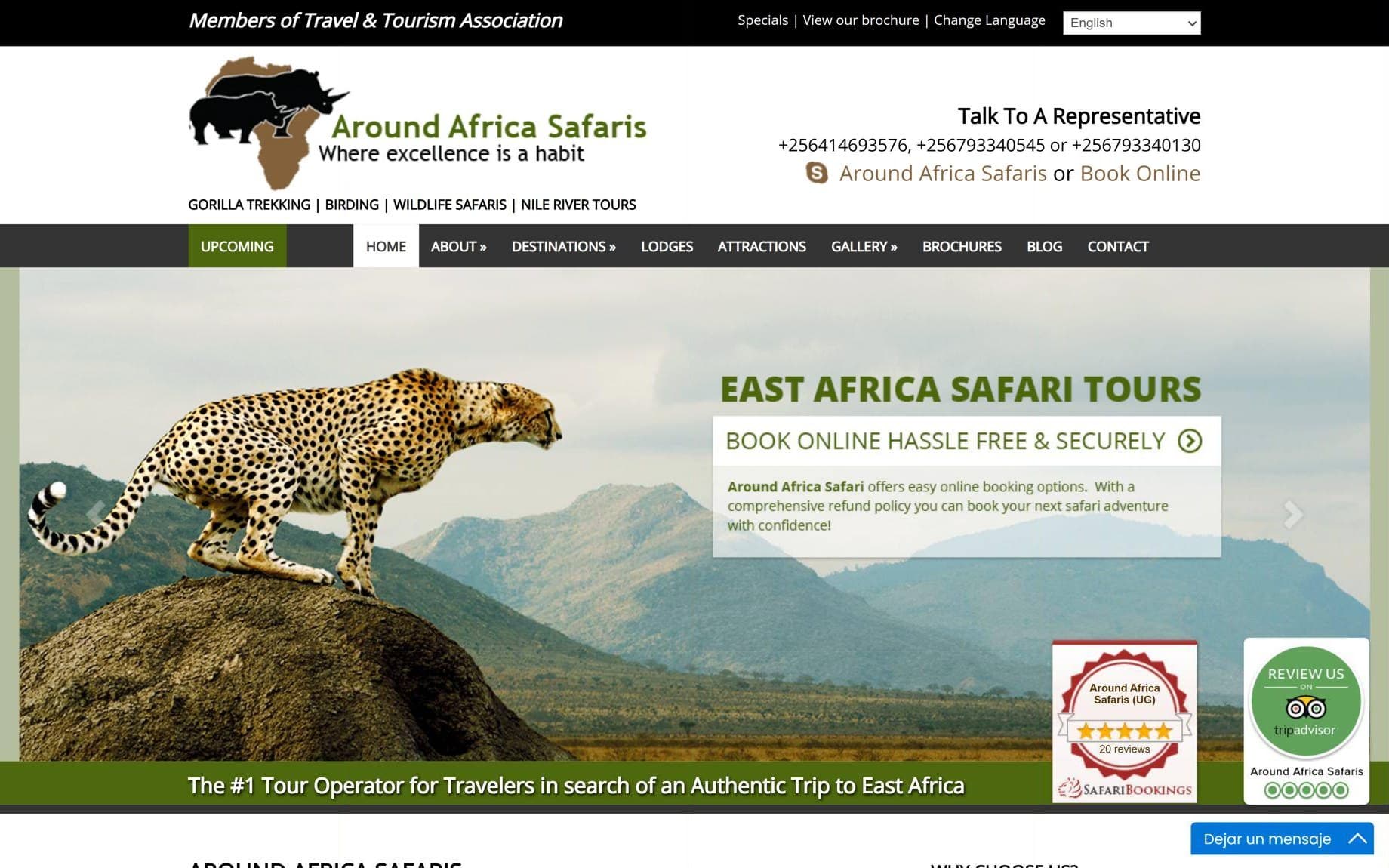
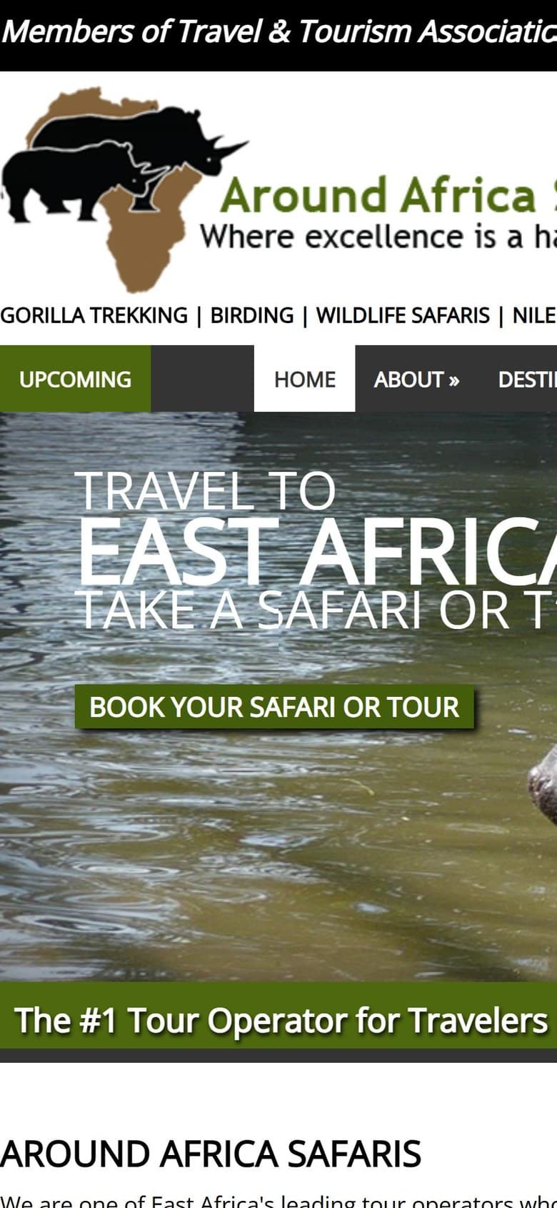
The original website, on desktop and on a phone.
Ten problems with the website
01
No mobile version
The page is fixed at 1,050 px wide: on a phone you have to scroll horizontally and can’t zoom out.
02
No clear path to request a trip
Five different calls to action lead to the same generic form, which doesn’t ask for destination, dates or travelers.
03
Hidden trips
No pages of their own: dropdowns inside destination pages, impossible to link to or share.
04
Outdated information on display
Events, offers and prices from past seasons, and an old brochure linked twice.
05
A menu designed from the company’s point of view
Ten items, a top bar and 93 links on the home page.
06
Unbacked promises
“The #1 Tour Operator”, online booking and refunds the company didn’t offer, some of them inside images.
07
Buried proof
The five stars on Tripadvisor and SafariBookings, in a corner of the slider; the testimonials, at the very bottom.
08
An identity without a system
Four typefaces, and olive green, brown and black with no hierarchy.
09
Accessibility
14 of the 24 images on the home page without alt text, the main message in an H4 and carousels that advance on their own.
10
Endless pages
About 4,700 words on the Uganda page, with the same notice repeated in every itinerary.
Excerpt from the landing page audit
Section
What was there
Verdict
Change
Header
Nine-item menu, account icon, search and language selector
Changes
Five sections and a fixed “Plan my trip”
Hero
Video with promises of online booking and refunds
Changes
The video stays; a positioning headline replaces the promises
Ratings
Tripadvisor and SafariBookings, under the headline “The #1 Tour Operator”
Moves up
Moved right below the hero; the “#1” is dropped
Information slider
Four paragraphs of unproven claims
Removed
Its role moves to “Why travel with us” and “How it works”
Why choose us
Mosaic of eleven photos with text only on hover
Changes
Six cards with the text always visible
Trips
Five cards with just a title, at 65% of the page
Moves up
Third section, with tabs by country and each trip’s details
Featured videos
A player with five thumbnails
Merged
The video moves to the hero and to each experience page
Memberships
Nine association logos
Kept
Its own section, with each association’s name
Footer
An email address and phone number different from the rest of the site
Changes
A single set of contact details
04 · The brand
The same concept, better drawn
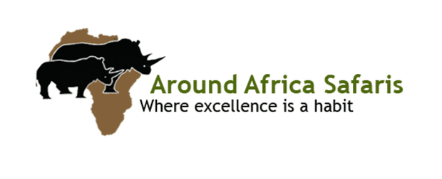
The logo already had a strong idea: a rhino inside the African continent. The client wanted to keep it, so the work was about drawing, not concept. The original combined a brown map, two overlapping rhinos, an olive-green wordmark and a tagline, “Where excellence is a habit”, which added a fourth line of text and disappeared at small sizes.
The proposal rebuilds the continent with straight, faceted cuts. A single cut in the landmass draws the rhino’s head and horn, so one shape replaces the map with two animals on top. The wordmark gains weight, “SAFARIS” opens up with wide letterspacing and the tagline goes.
Before
Brown map, two rhinos, olive wordmark and tagline.
Proposal
A faceted silhouette, a wordmark with weight and no tagline.
Horizontal, the primary versionWebsite header, documents and signage.
StackedSquare formats, social media and vehicles.
SymbolFavicon, avatar and small spaces.
WordmarkOnly when the symbol already appears nearby.
Minimum sizes: 140 px wide for the horizontal version, 64 px for the stacked version and 24 px for the symbol. Below that, the 16 px favicon uses the symbol only.
05 · The system
Color, typography, graphic device and voice
The logo was the starting point. Around it, we defined a system so any piece, from the website to a business card, is recognized as the same brand. Everything is documented in a five-chapter guide: brand, logo, color, typography and applications.
Color
The palette comes from the places the company sells: the greens of the bush and the forest, the grey of the rhino, dry grass in the late afternoon and sunset over the savanna. Every text and background combination the guidelines allow meets WCAG AA.
Primary
Acacia Green#1E6B43Buttons, links and logo on light backgrounds.
Rhino Grey#383838Logo background, navigation and dark sections.
Secondary
Savanna Gold#D9A441Labels and details on dark backgrounds.
Sunset Orange#D9622BOccasional accents.
Bwindi Green#123A28Deep sections, hero and footer.
Neutrals
Ink#1E1F1CText.
Stone#65615ASecondary text.
Sand#EAE2D0Cards and alternating sections.
Ivory#F8F5EEPage background.
Typography
Exo 2 brings the logo’s angular energy to the headlines; Roboto keeps long itineraries readable. Both are from Google Fonts, with no licensing cost for the client.
Aa
Exo 2Headlines · 600, 700, 800
Aa
RobotoText · 400, 500, 700
Uganda & Rwanda · 14 days
Best of Uganda & Rwanda
Chimpanzees in Kibale, boat safaris on the Kazinga Channel and a morning with the mountain gorillas of Volcanoes National Park.
Graphic device
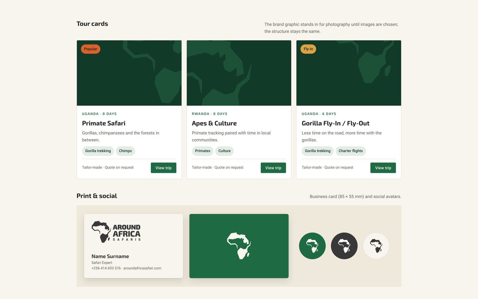
The cut that draws the rhino becomes the system’s graphic device: a clipped corner on cards, photos, badges and step buttons, triangular bullets, and the symbol tone-on-tone in dark blocks or when a photo is missing.
The symbol’s cut: one line in the landmass draws the head and horn.
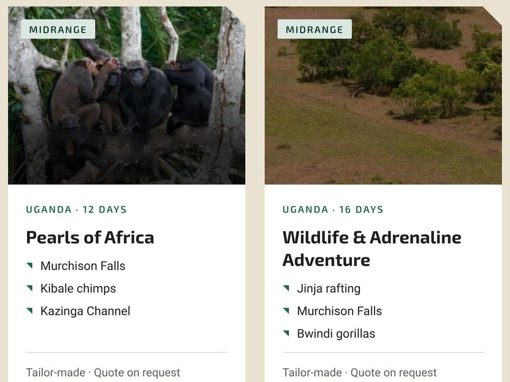
Clipped corners and triangular bullets on the trip cards.
The symbol tone-on-tone, here in the contact block of Plan my trip.
Voice
Three traits guide how the brand looks and sounds, on the website and in every message to a traveler.
Expert
Concrete, practical and calm. It knows the parks, the permits and the roads.
Sounds like this
“Gorilla permits are limited, so we secure yours first.”
Not like this
“An amazing unforgettable adventure awaits!!!”
Approachable
Personal and welcoming. Every trip starts with a conversation.
Sounds like this
“Tell us how you like to travel and we’ll shape the trip around it.”
Not like this
“Please submit the inquiry form.”
Authentic
Real places, real people and honest descriptions of what a day is like.
Sounds like this
“Long drives on red-earth roads, and evenings you won’t forget.”
Not like this
“A luxury paradise experience.”
Guidelines
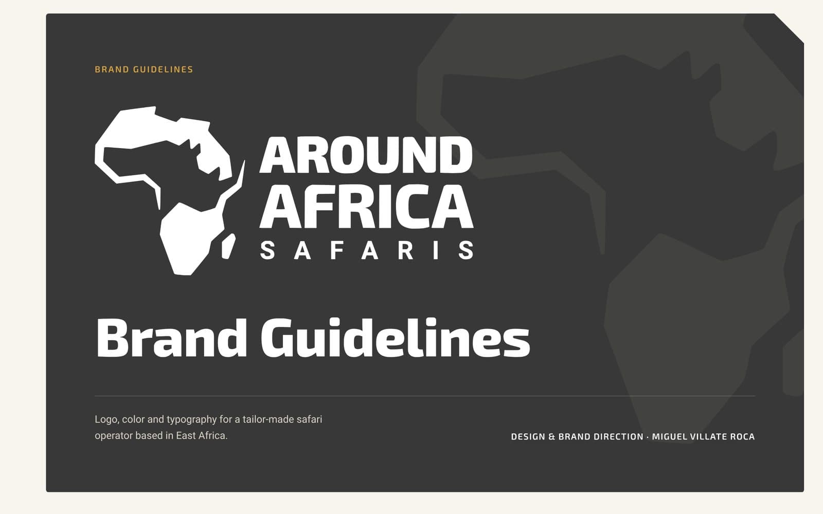
Five chapters: brand, logo, color, typography and applications. Each logo version, each color and each text style comes with its use and its limits.
Cover.
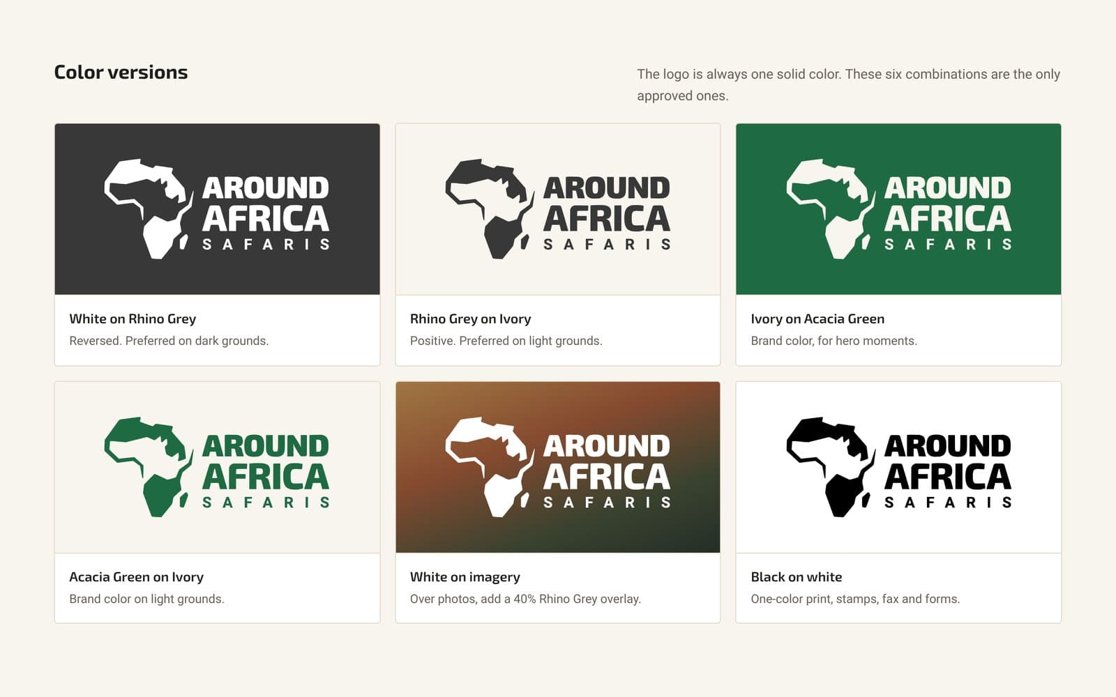
The six color versions of the logo.
Applications: trip cards, business card and avatars.
06 · Architecture and content
Five sections and a single action
The site menu had ten items; the new one has five: Destinations, Trips, Experiences, About and Travel guide. Next to it, always visible, a single button: “Plan my trip”. Each page has a single primary action, and it’s always that one or a variant, such as “Request this trip” or “Plan a gorilla trip”.
Destinations
Uganda
Rwanda
Kenya
Tanzania
Burundi
Replaces:Destinations (6 pages)
Trips
All trips, with filters
23 trip pages
Beach extensions
Replaces: the trips hidden in destination pages, Beach Holidays and Specials
Experiences
Gorilla trekking
Chimpanzees & primates
Big game safaris
Birding
The Nile & adventure
Mountains & hiking
Rhinos at Ziwa
Culture & community
Replaces:Attractions, Photo Gallery and Safari Videos
About
Our story & team
How we travel
Responsible travel
Lodges we use
Reviews
Replaces:About, Our Team, Vehicles, Flights, Testimonials and Lodges
Travel guide
Planning & booking
Gorilla permits
Visas & health
When to go
Packing lists
Money & tipping
Replaces:FAQs, Blog and Brochures
Primary action
Plan my trip
4-step form
Thank you & next steps
Contact details
Replaces:Contact and every link labeled “Book your safari or tour”
The content was written before the design: one document per page with its purpose, its primary action and the copy for each section. The rule was to invent nothing. The site’s 27 itineraries became 23 after merging duplicates, and their names don’t include days or style: that information goes on the card. The published prices were out of date, so every trip shows “Tailor-made · Quote on request” and keeps a slot for the price. Anything the client’s material didn’t resolve went into a log of 14 decisions to validate with them.
Three decisions from the log
Pricing
“Tailor-made · Quote on request” on every trip, with a slot for the price.
Online booking and refunds
Off the website until they exist.
Contact
One email address, one phone number and WhatsApp: the ones on the official site.
07 · The home page
The home page, from first visit to inquiry
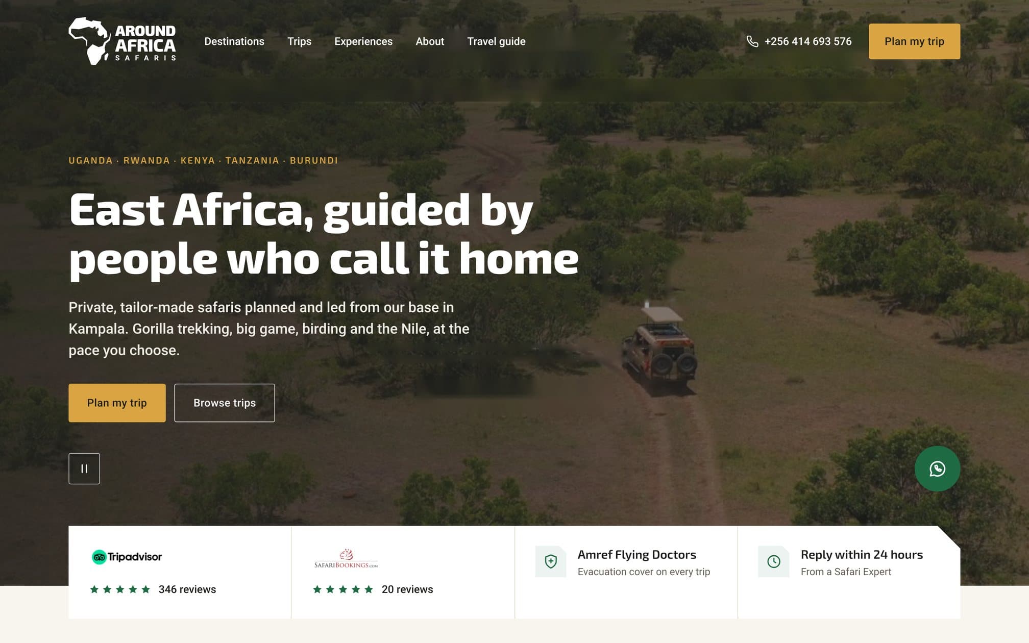
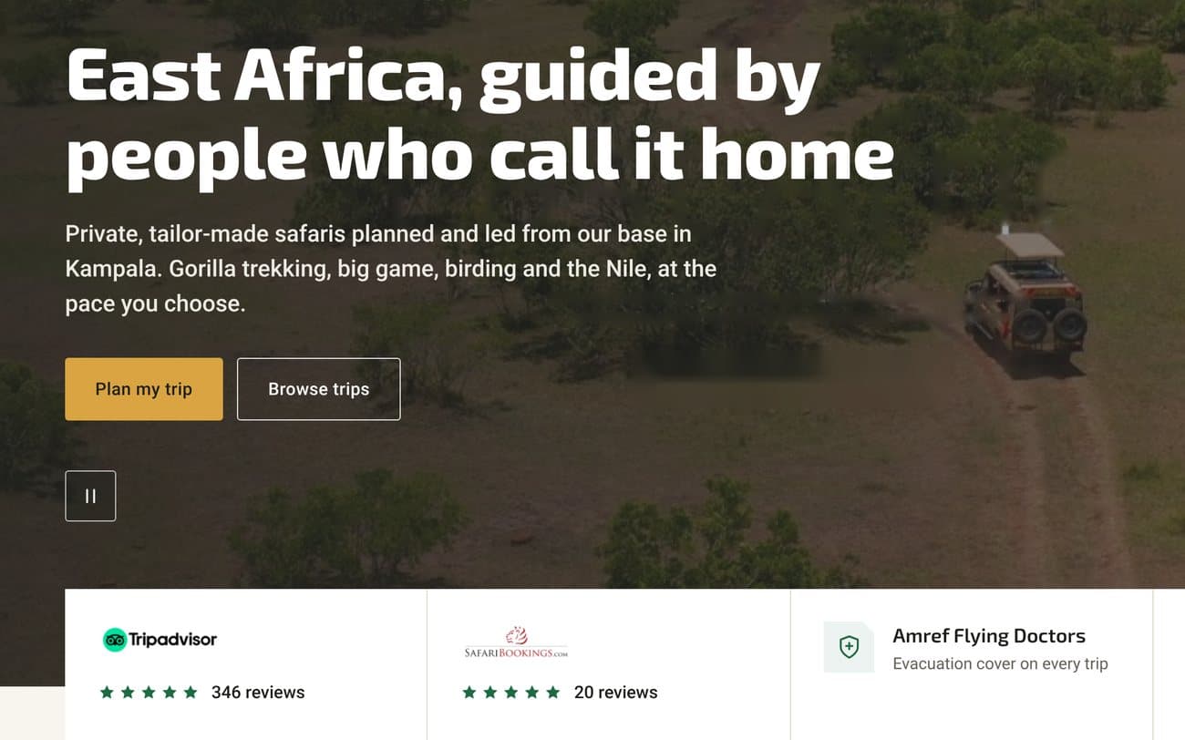
The home page has a single job: turning a first visit into an inquiry. The sections follow the order of the traveler’s questions: who will guide them, what they can see, what trips there are, why this company and how to get started.
The complete home page, from header to footer.
Nine sections, in the order of the questions
01
Hero. The positioning in one line, with the proof strip below.
02
Experiences. Start with what you want to see, not with a country.
03
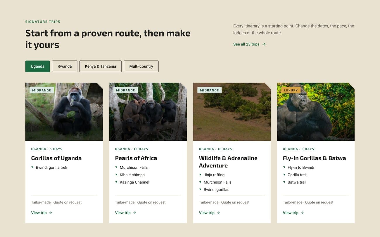
Trips. Real routes by country, open to changes.
04
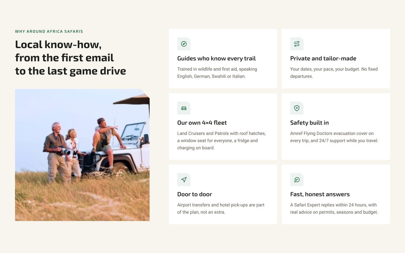
Why travel with them. Six reasons the company can prove.
05
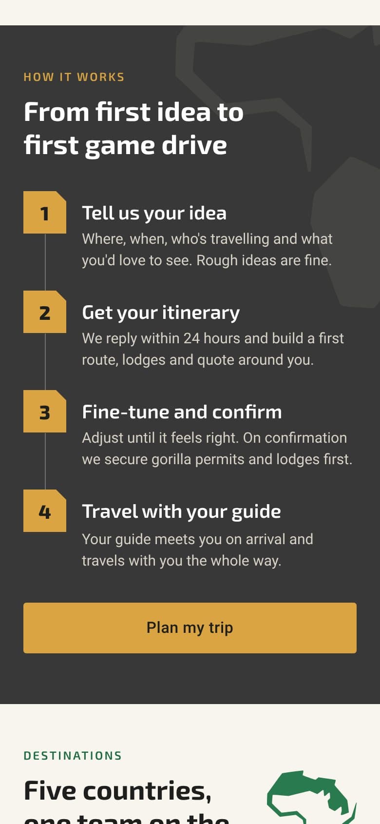
How it works. Four steps, from idea to first safari.
06
Destinations. Five countries and one team on the ground.
07
Accommodation. Lodges chosen for their setting and their people.
08
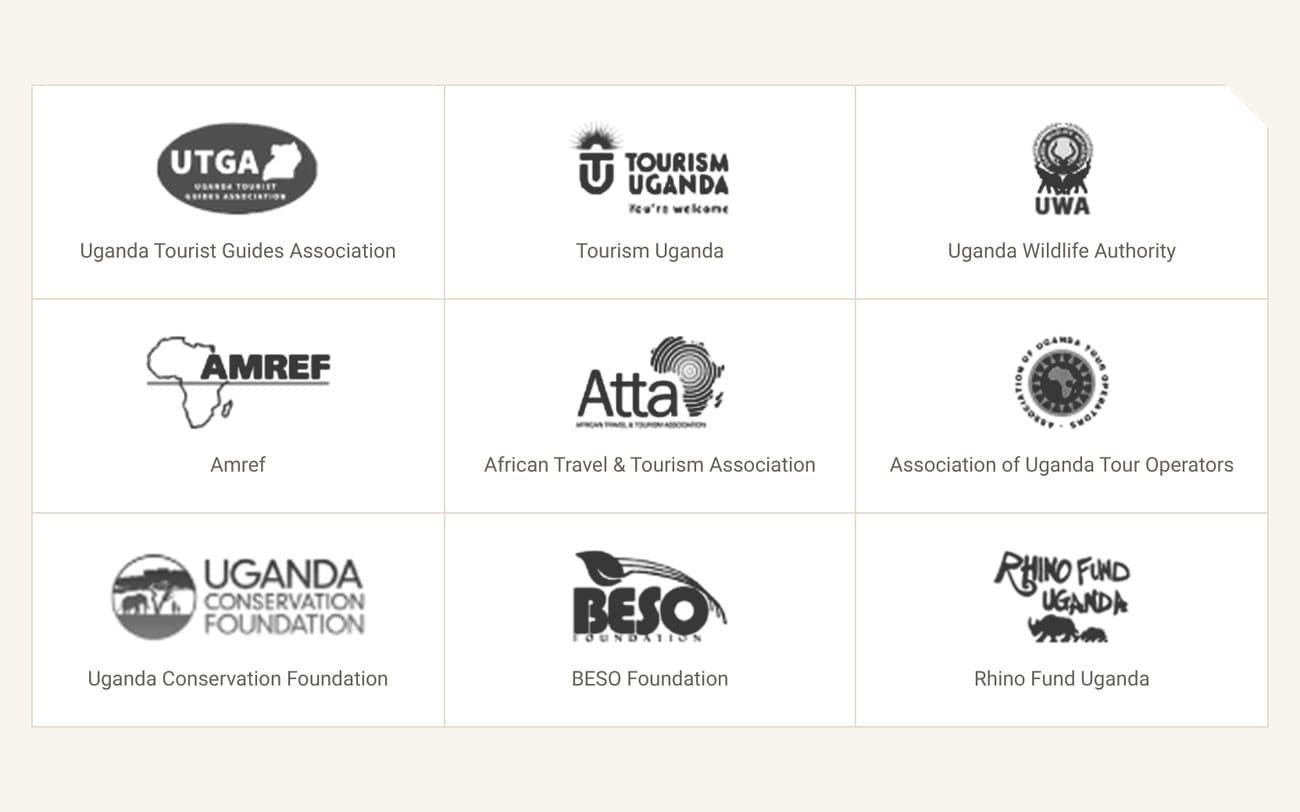
Memberships. Nine tourism and conservation associations, named.
09
Reviews. Three short quotes, visible at once.
At the top, the header with the five sections and “Plan my trip” always in view. At the bottom, the footer with everything practical in one place.
Proof on the first screen
The Tripadvisor and SafariBookings ratings, medical evacuation coverage and the 24-hour response move up under the headline. The “#1 Tour Operator” is dropped: no one could prove it.
Trips, in third position
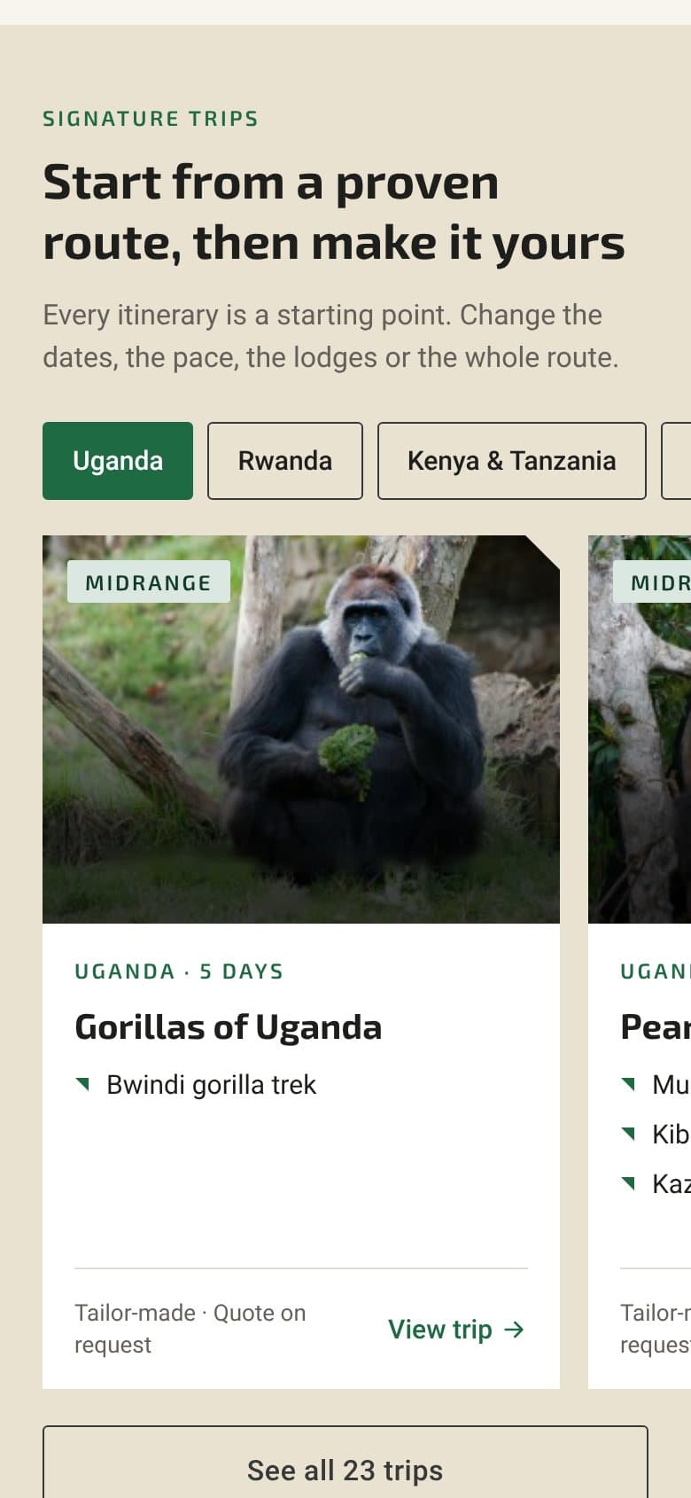
Tabs by country and cards with photo, style, days, countries, highlights and “Quote on request”. In the starting landing page they sat at 65% of the page and only had a title.
Reasons you can read without touching anything
From eleven photos with text on hover to six cards with visible text. The reasons that couldn’t be proven were dropped.
Named memberships
Nine tourism and conservation associations, each with its logo and its name. Discreet proof, right before the reviews.
08 · Plan my trip
A form that doesn’t feel like a booking
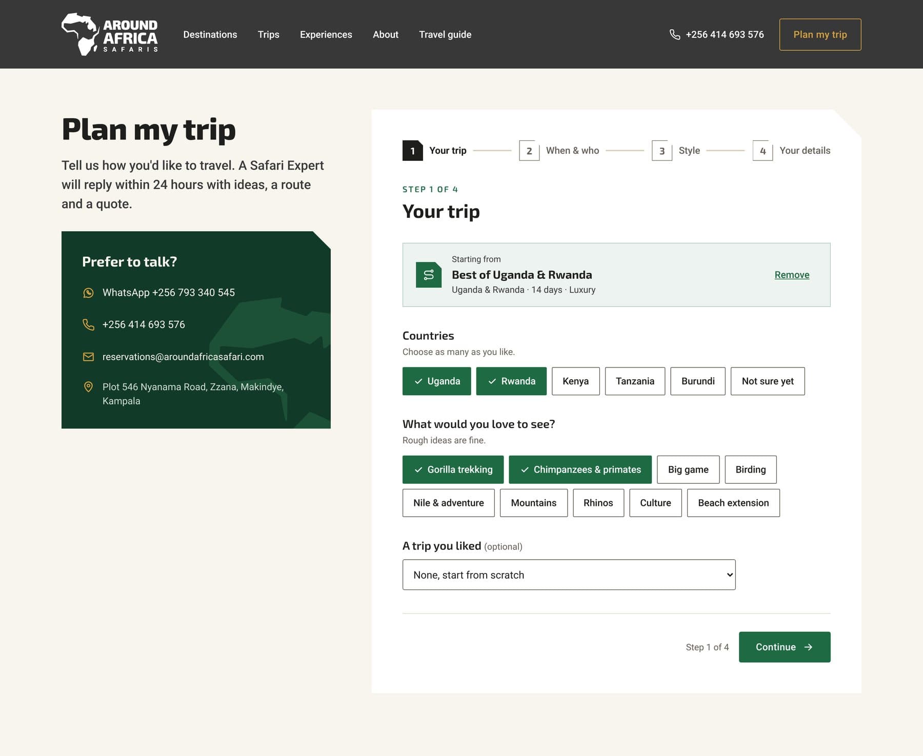
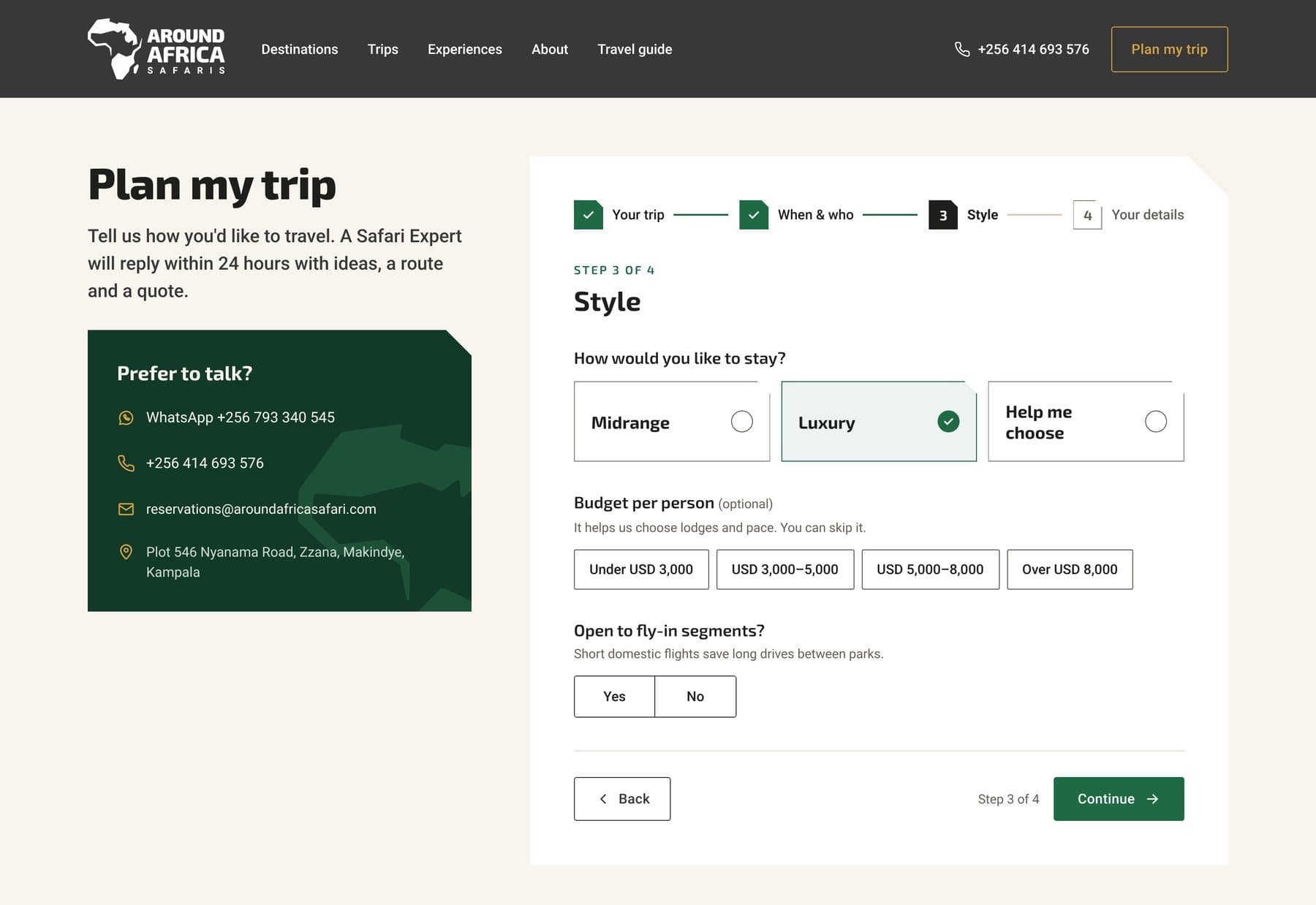
The whole website leads to an inquiry, and the site had no visible form. Plan my trip asks for what a Safari Expert needs to send a useful first proposal, without the traveler feeling like they’re booking.
1
Your trip
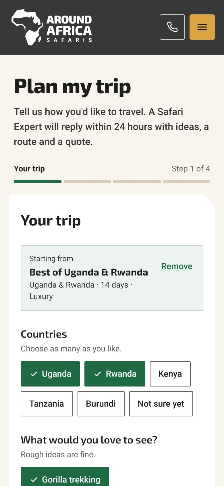
Countries, interests as chips and, optionally, a trip from the catalog as a starting point.
2
When & who
Exact dates, a month or flexible; length; adults and children with their ages.
3
Style
Midrange, Luxury or “Help me choose”; budget range, optional; domestic flights, yes or no.
4
Your details
Name, email and country; phone or WhatsApp and comments, optional; privacy consent.
Final
Thank you
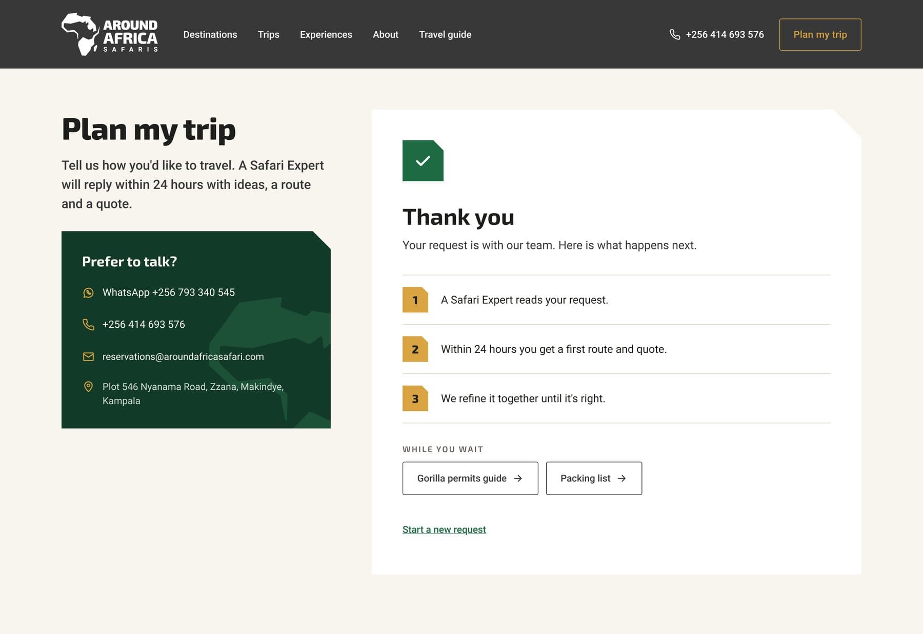
What happens next: a Safari Expert reads it, a first route with a quote arrives within 24 hours and it’s fine-tuned together with the traveler.
Budget is asked in ranges and is optional: it gives context without making anyone uncomfortable.
When children’s ages are entered, a notice appears: gorilla trekking is for ages 15 and up.
WhatsApp, phone and email are visible from the start, for anyone who prefers to talk.
When arriving from a trip, the form opens with that trip as the starting point.
Step 1, Your trip, opened from a trip page.
Step 3, Style.
Thank you.
09 · On mobile
Mobile-specific decisions
The mobile version isn’t the desktop one squeezed down. It has its own decisions:
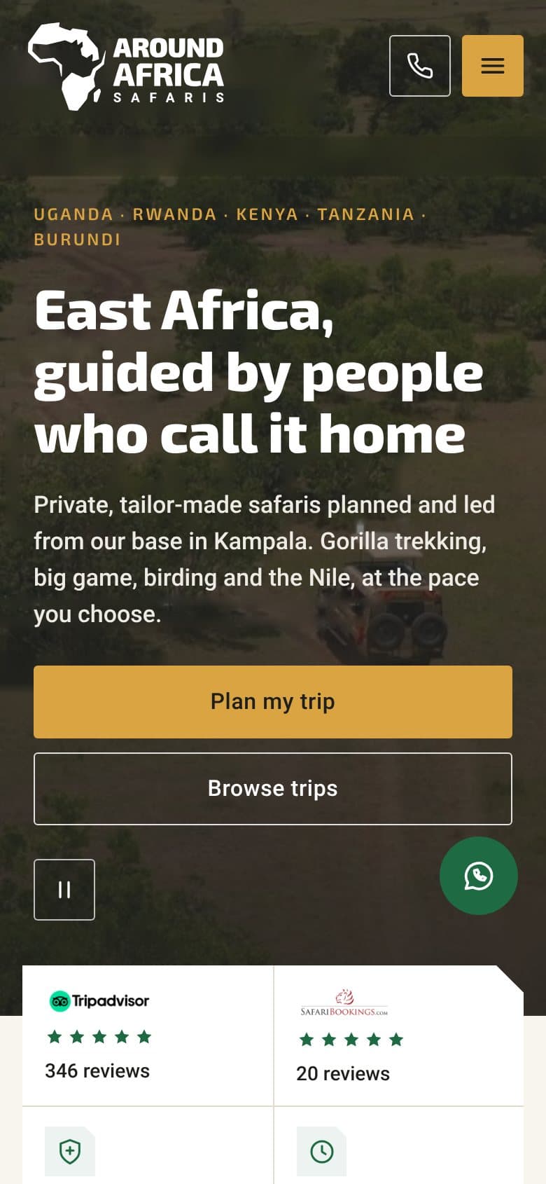
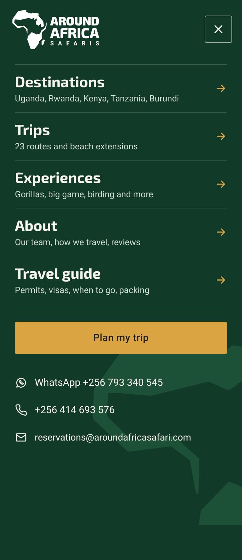
The header is reduced to logo, direct call and menu. Navigation moves to a full-screen menu that ends in “Plan my trip”.
A floating WhatsApp button stays with you down the whole page.
Tabs, trips, reasons and reviews scroll horizontally, with the next card peeking in.
“How it works” becomes a vertical timeline.
Form fields are full width and 16 px, so iOS doesn’t zoom in while typing.
Phone, email and WhatsApp are direct links, and every touch target is at least 44 px.
Menu.
Trips.
How it works.
Plan my trip.
10 · The delivery
What was delivered
The full proposal was delivered: the logo refresh with its guidelines, the sitemap, the content for the six main pages and the design of the home page and Plan my trip on desktop and mobile. The project was never implemented and the logo remained a proposal. Every design decision answers a specific problem from the audit.
10 → to 5Menu items
11 → to 6Reasons to book
27 → to 23Itineraries
65% → to 3rdPosition of trips on the home page
Senior Designer | Branding · Motion · UX · AI Production