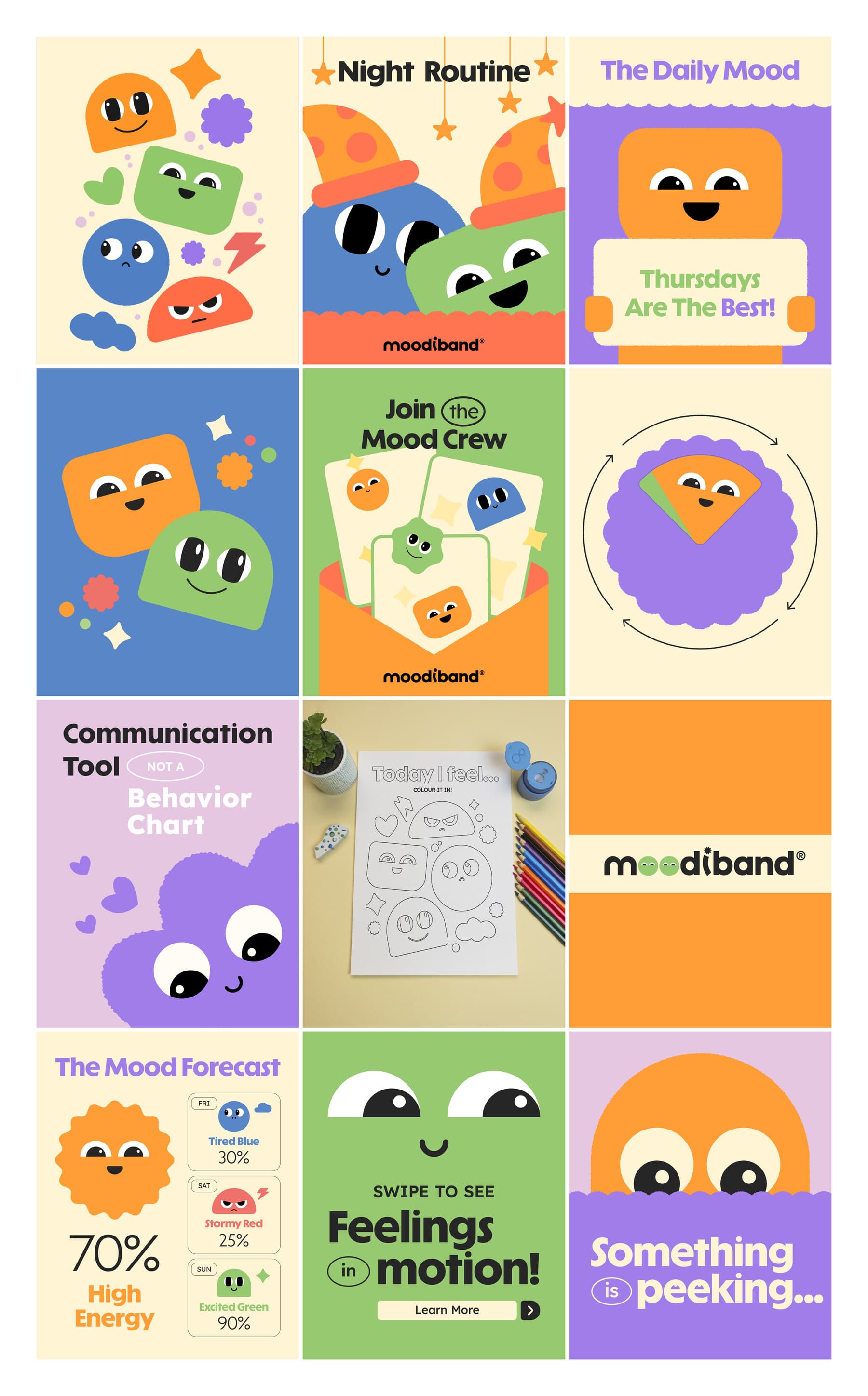
Social content proposal for a children’s emotional wellbeing brand: twelve posts across statics, carousels and 2D animation, built on its identity and its children’s book. The client signed after seeing it.
Client
Children’s emotional wellbeing brand
Brief
Social content proposal, two months
Timeline
3 days
Outcome
Account won
Role
Creative direction and production
Social content
2D animation
Visual system
01 · The brief
A two-month calendar for a feelings bracelet
Moodiband is a bracelet with a dial kids turn to show how they feel. Each color is an emotion and each emotion has a character: green for calm, yellow for energy, red for when they need space and blue for when they need a hug. The brand insists on one idea: there are no bad colors, and the bracelet isn’t a reward-and-punishment system.
The social accounts team wrote a calendar for August and September: twelve posts, each with its concept, design instructions and caption. Our job was to turn it into finished pieces to present to the client before they signed.
The calendar
Date
Format
Pillar
Post
Aug 14
Static
Meet the Mood Crew
Teaser: Peeking Eyes
Aug 18
Carousel
Meet the Mood Crew
Eyes Rolling Across Frames
Aug 21
Static
Parenting Wins
Mood Forecast
Aug 26
Reel
Meet the Mood Crew
Meet the Mood Crew
Aug 31
Carousel
Kids Content
Printable Activity Preview
Sep 3
Carousel
Parenting Wins
Tool vs. Behavior Chart
Sep 6
Looping reel
Community
Sunday Mood Check
Sep 10
Static
Community
Newsletter Announcement
Sep 16
Looping reel
Kids Content
Dance & Movement Loop
Sep 24
Static
Meet the Mood Crew
Breaking News: Sunny’s Pick
Sep 29
Carousel
Parenting Wins
Bedtime Routine
Sep 30
Reel with voiceover
Education
Meet the Mood Crew
I led the project and also designed and animated pieces alongside a designer and a video editor. Tools: Illustrator, Figma, Photoshop, After Effects, Premiere Pro and ElevenLabs for the voice.
02 · The starting point
An identity and a book, but no system for social
The brand had an identity in development, with five logo proposals, an eight-color palette and two typefaces, Solar Display and Lexend Deca. It also had a children’s book that introduces the characters in pastel tones. There was nothing designed for social: no pieces, no templates, no rules for using the characters.
The system came out of those two documents. We didn’t add new colors, typefaces or characters.
Client material
Cover of the children’s book.
Client material
An application of the wordmark in the identity: the scalloped band with two eyes.
03 · The system
A system drawn from the identity
Three decisions were enough for twelve posts across five different pillars to read as a single brand.
Characters for a small screen
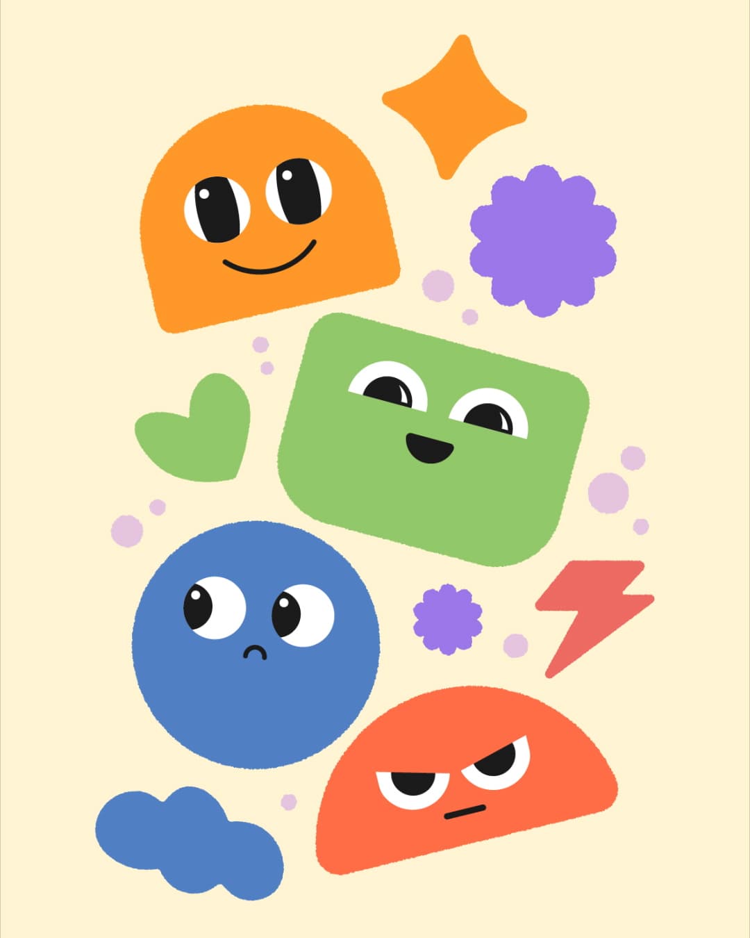
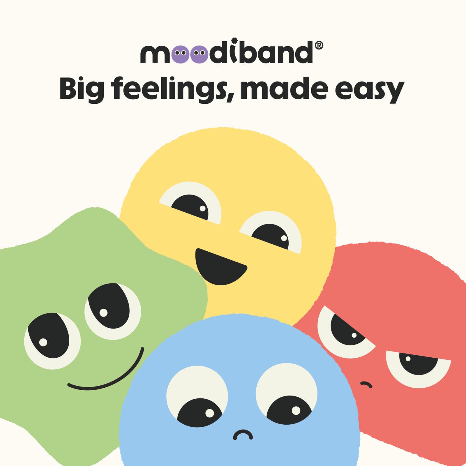
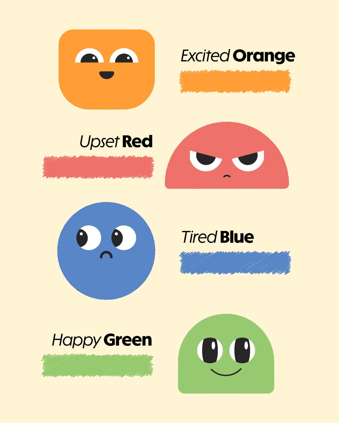
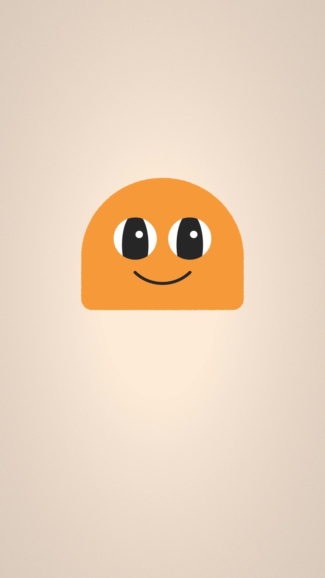
The book’s characters are pastel with soft shapes. We redrew them with more geometric, flat shapes in the identity’s saturated colors, so they read on a phone. The palette has no yellow, so energy became orange, the brand’s #FF9D35.
The band with eyes
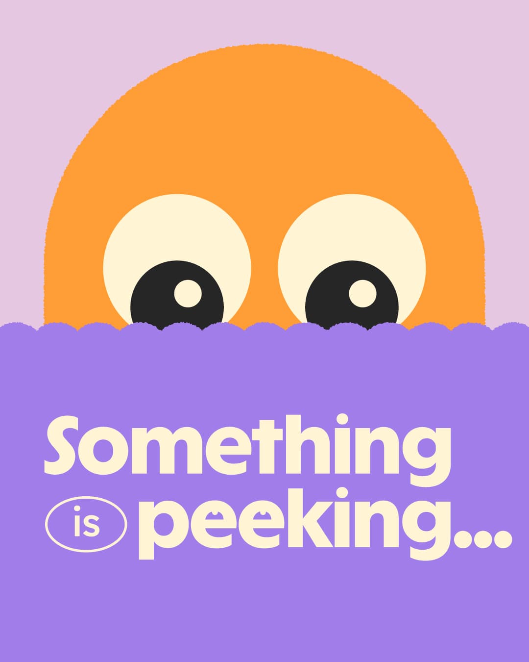
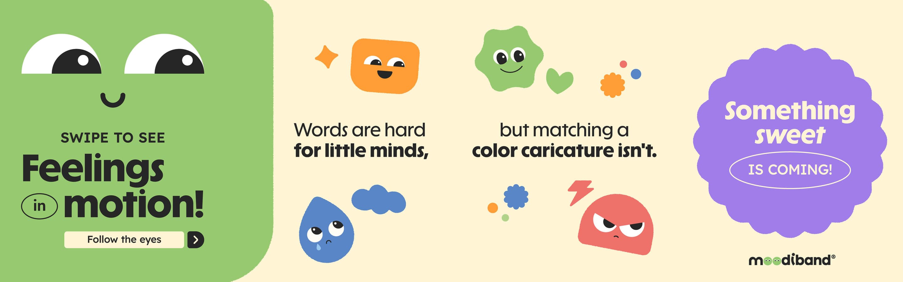
In the identity, the wordmark rests on a scalloped band with two eyes peeking out. We used it for the teaser: a character peeking out before being introduced.
A stamp for every call to action
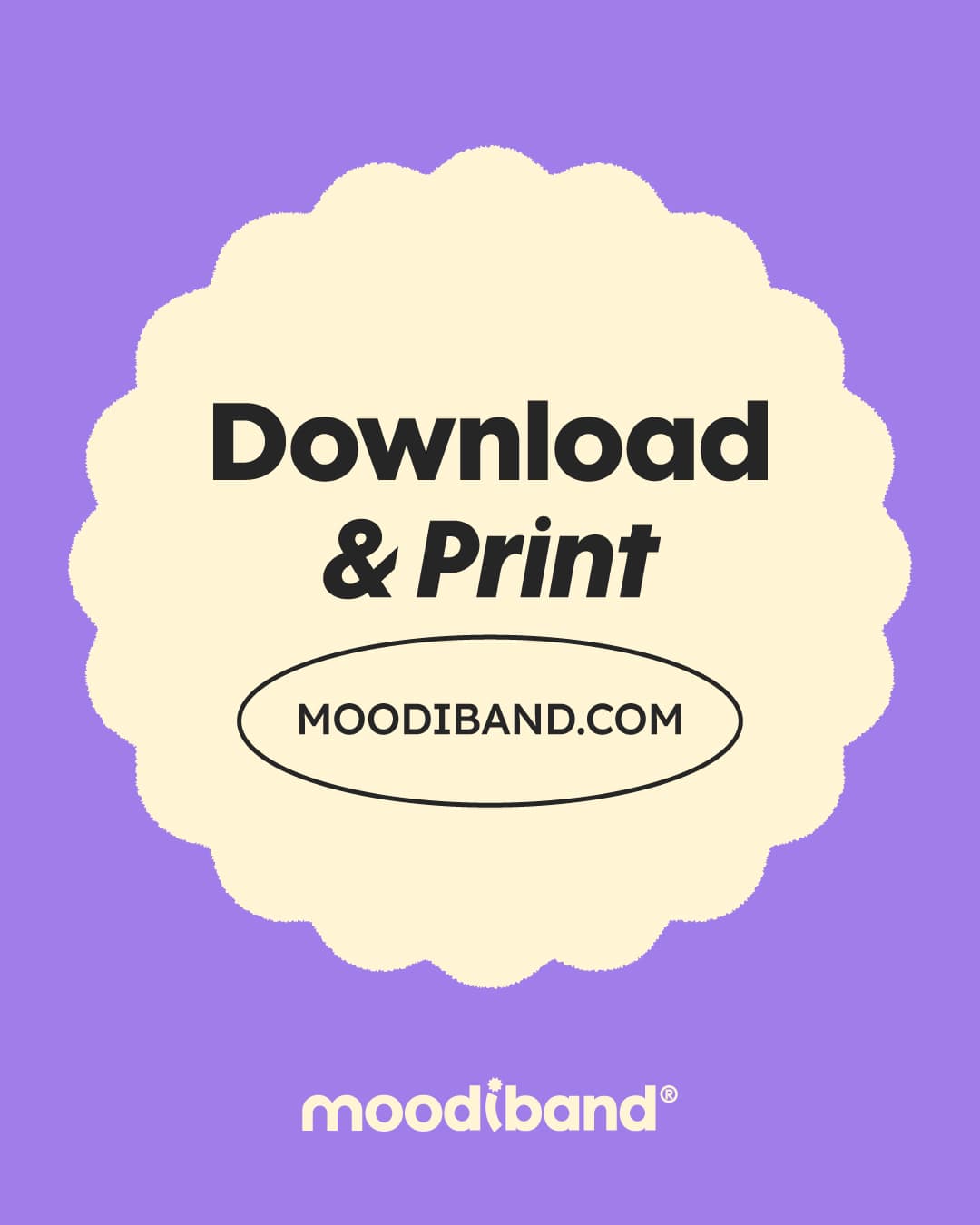
The band’s scalloped edge, which the bracelet’s dial also has, is used as a stamp for key messages: “Something sweet is coming!”, “Download & Print” and “No fixing. No judging.”.
Typography: Solar Display for headlines and Lexend Deca for text, as the identity required. Format: 4:5 for the feed and 9:16 for reels.
04 · Carousels
Carousels that read in one go
Each carousel spreads one idea across three or four slides. In the first, the green panel crosses the cut between the first and second slides, so swiping reads as a single strip.
Feelings in motion
4 slides
The background continues from one slide to the next.
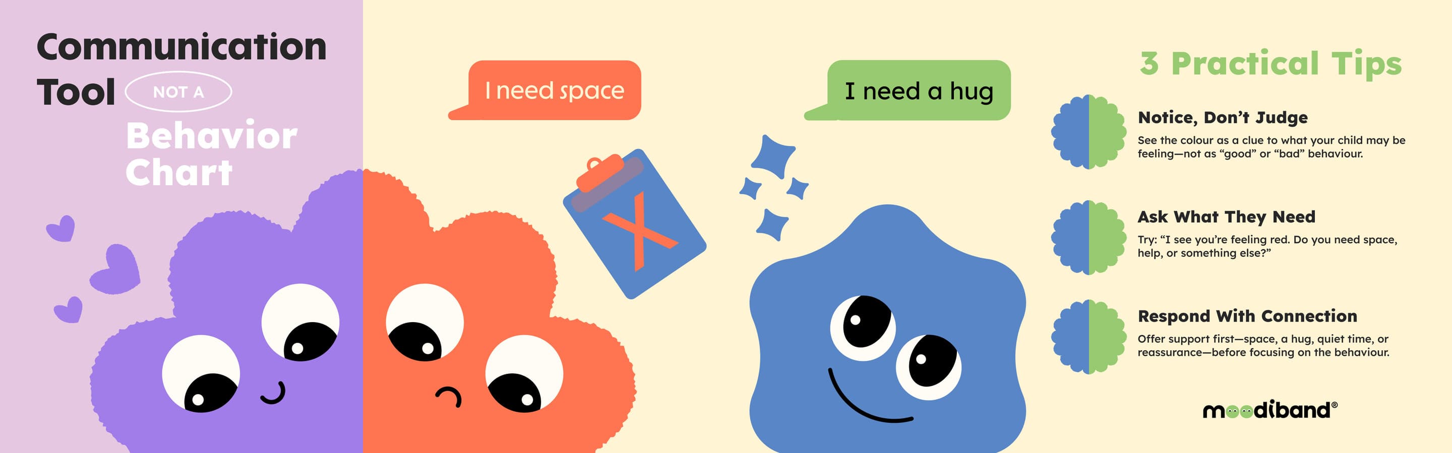
Communication Tool
4 slides
The brand’s core message for parents: a tool for talking, not a behavior chart.
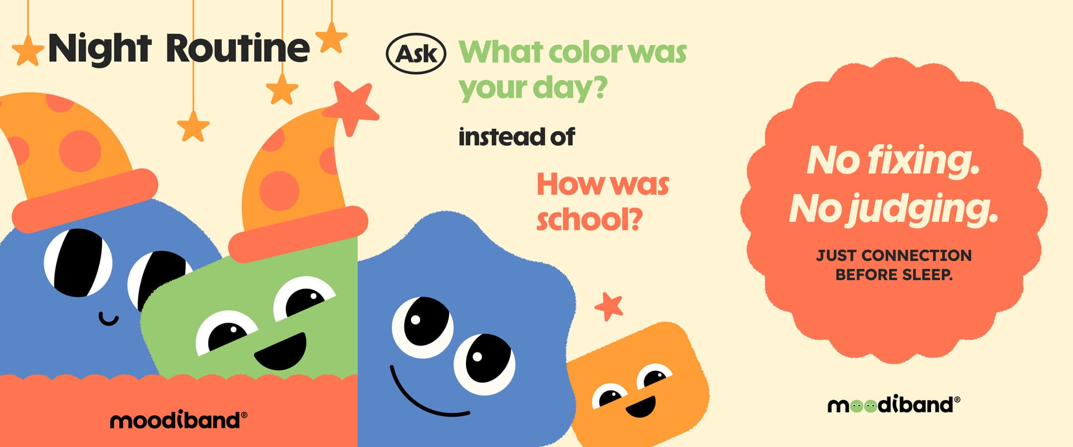
Night Routine
3 slides
A question for before bed: “What color was your day?”.
05 · Animation
Modular 2D animation
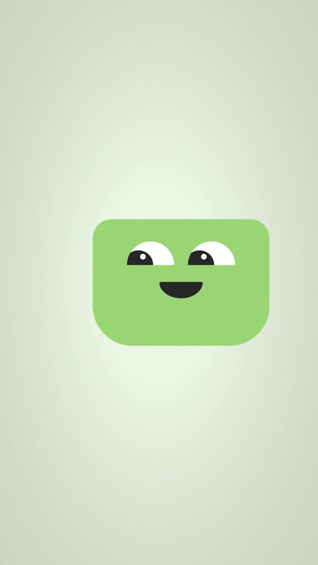
The first thing we animated was the wordmark: the two “o”s in Moodiband cycle through the faces of the four characters. That animation closes the first reel and the final one.
Each reel was built with pieces from the previous one. The first introduces the characters one by one, each on a background in its own color. The second is an eight-second loop with the bracelet’s dial. The final reel reuses the animations from both and adds voice.
01
Animated wordmark
6 s
The two “o”s change faces.
02
Meet the Mood Crew
13 s
One character per emotion, each on its own background.
03
Sunday Mood Check
8 s loop
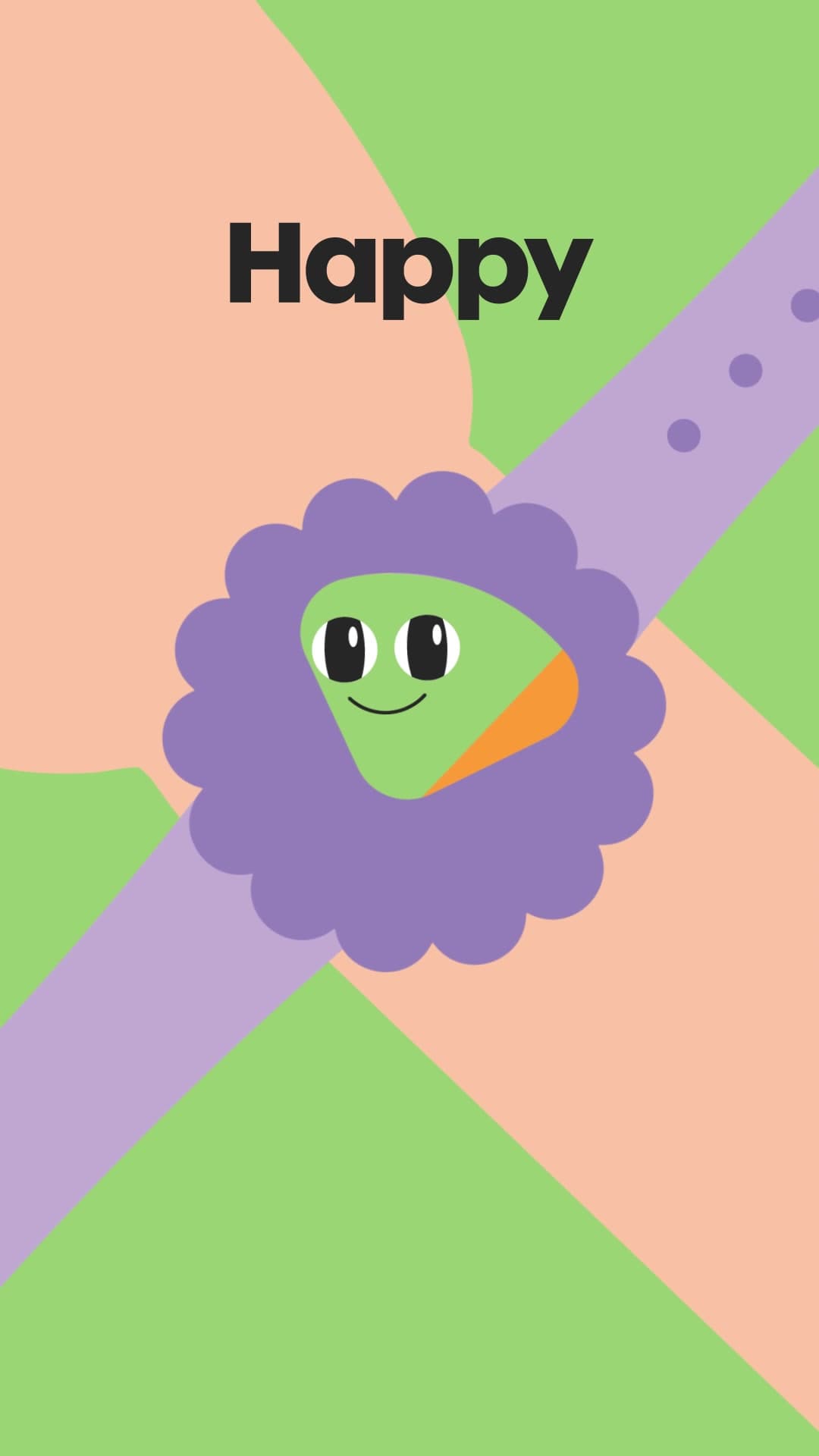
The dial turns from Happy to Sad and loops back to the start seamlessly.
04
Final reel
39 s
Reuses the three modules and adds voiceover.
Combines all three
Meet the Mood Crew: one background per emotion.
Animated wordmark: the “o”s change faces.
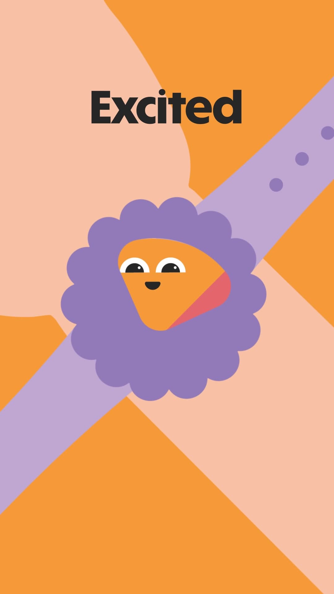
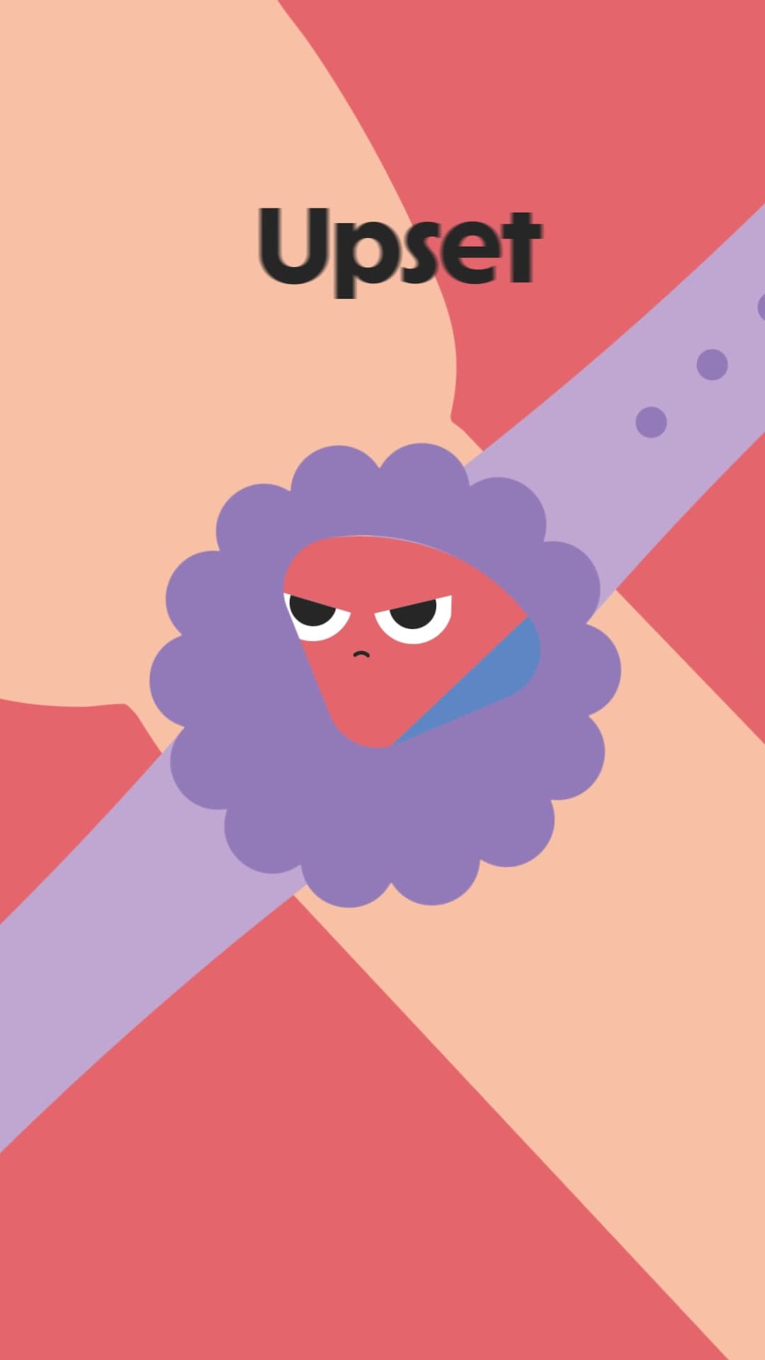
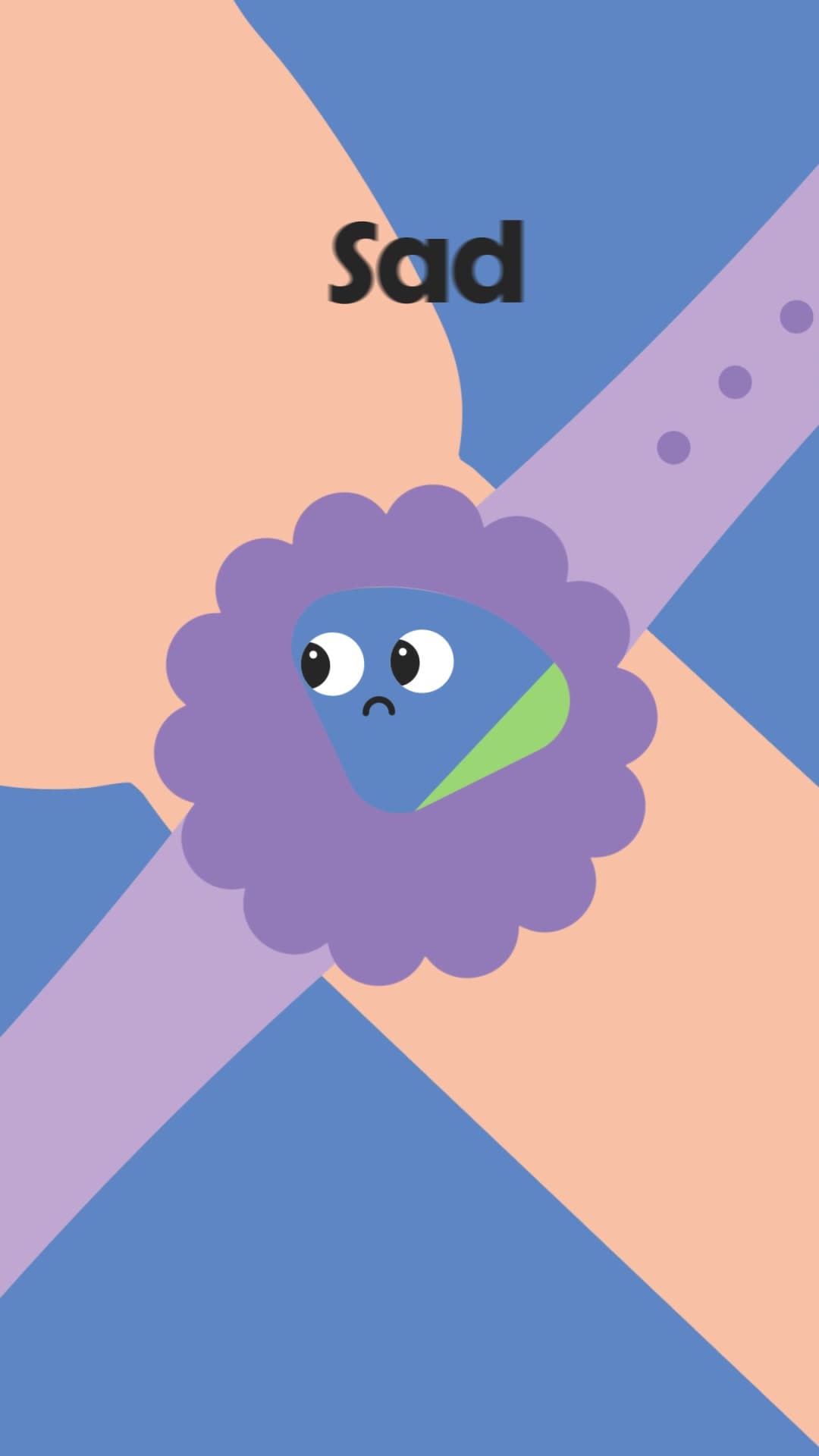
Happy
Excited
Upset
Sad
Sunday Mood Check: the background changes with each emotion.
The first reel used After Effects’ posterize time effect, which reduces the frame rate and gives the movement a hand-drawn animation feel.
06 · Script, voice and sound
A twelve-second script in a thirty-nine-second reel
Opening
The tagline, word by word
The calendar included the final reel’s script with a twelve-second rundown. Read at a natural pace for speaking to parents, it runs over thirty, so we extended the reel to thirty-nine seconds instead of cutting the copy. The two lines the script reserved for on-screen titles, “There are no such things as bad emotions!” and “Feel it. Show it. Share it.”, also went into the voiceover, and the titles come in on the beat of each word.
The voice was generated with ElevenLabs, with the direction to read warmly. We tried four takes and, for the wordmark’s sonic signature, three different voices. Since it was a proposal, the synthetic voice served as a sample of what could be achieved with AI; after signing, the client approved continuing with this type of voice. The music is from Envato, and cartoon sound effects (bounces, a growl, a whimper) accompany the characters.
Final reel · full script
Scene
Image
Voice
1Opening
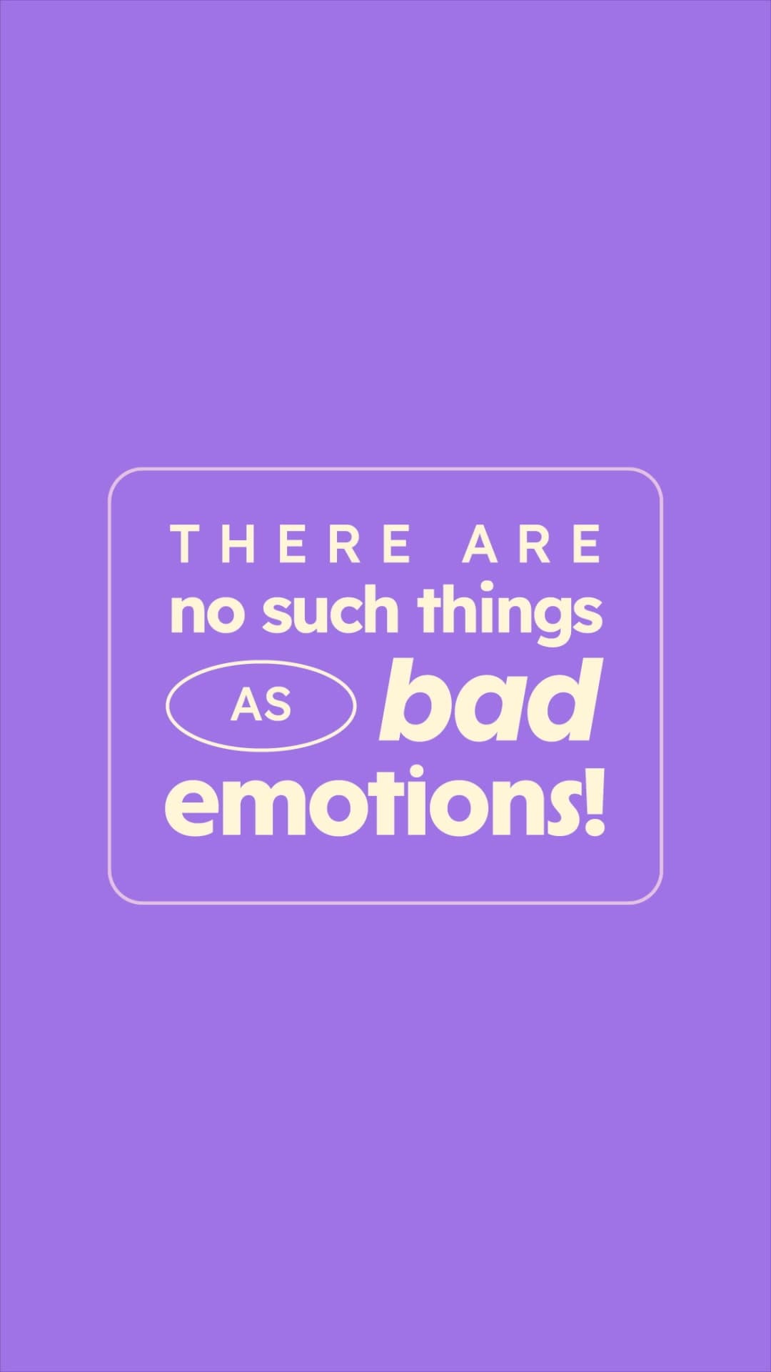
Title on a purple background: “There are no such things as bad emotions!”
“There are no such things as bad emotions.”
2The group
The four characters appear together on a cream background.
“Meet the Mood Crew, four big feelings that everyone carries around.”
3Green
The green character blinks calmly on a soft green background.
“Green is calm and steady. Ready to listen, play and chill.”
4Orange
The orange character bounces on a warm background.
“Sunny is bursting with yellow energy. Bouncy, excited and ready to go.”
5Red
The red character frowns on a pinkish background.
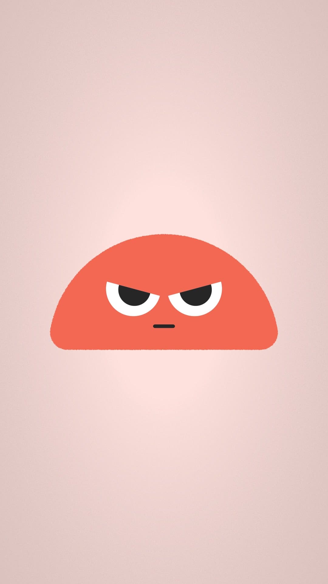
“Red isn’t a bad mood. It just means ‘I need space to cool down.’”
6Blue
The blue character blinks slowly and a drop falls.
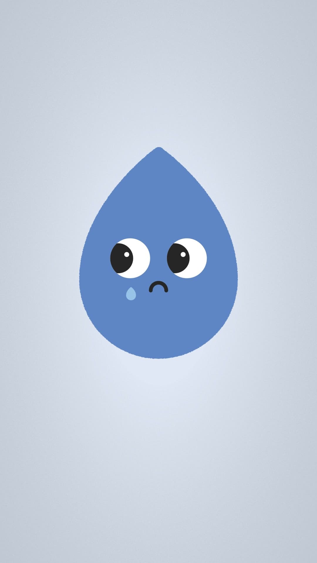
“And blue is low energy, gentle, quiet and usually needs a big hug.”
7Tagline
“Feel it. Show it. Share it.”, word by word.
“Feel it, show it, and share it.”
8The dial
The dial turns: Happy, Excited, Upset, Sad.
“Whatever color your child is feeling today, there’s space for all of them. Turn the dial with Moodiband.”
9Closing
Animated wordmark.
“Moodiband!”
07
Outcome
3days
12posts
3animated reels
Account won
The client signed after seeing the proposal. We arrived with two months of designed content instead of a sample, presented exactly as it would look on their Instagram profile.
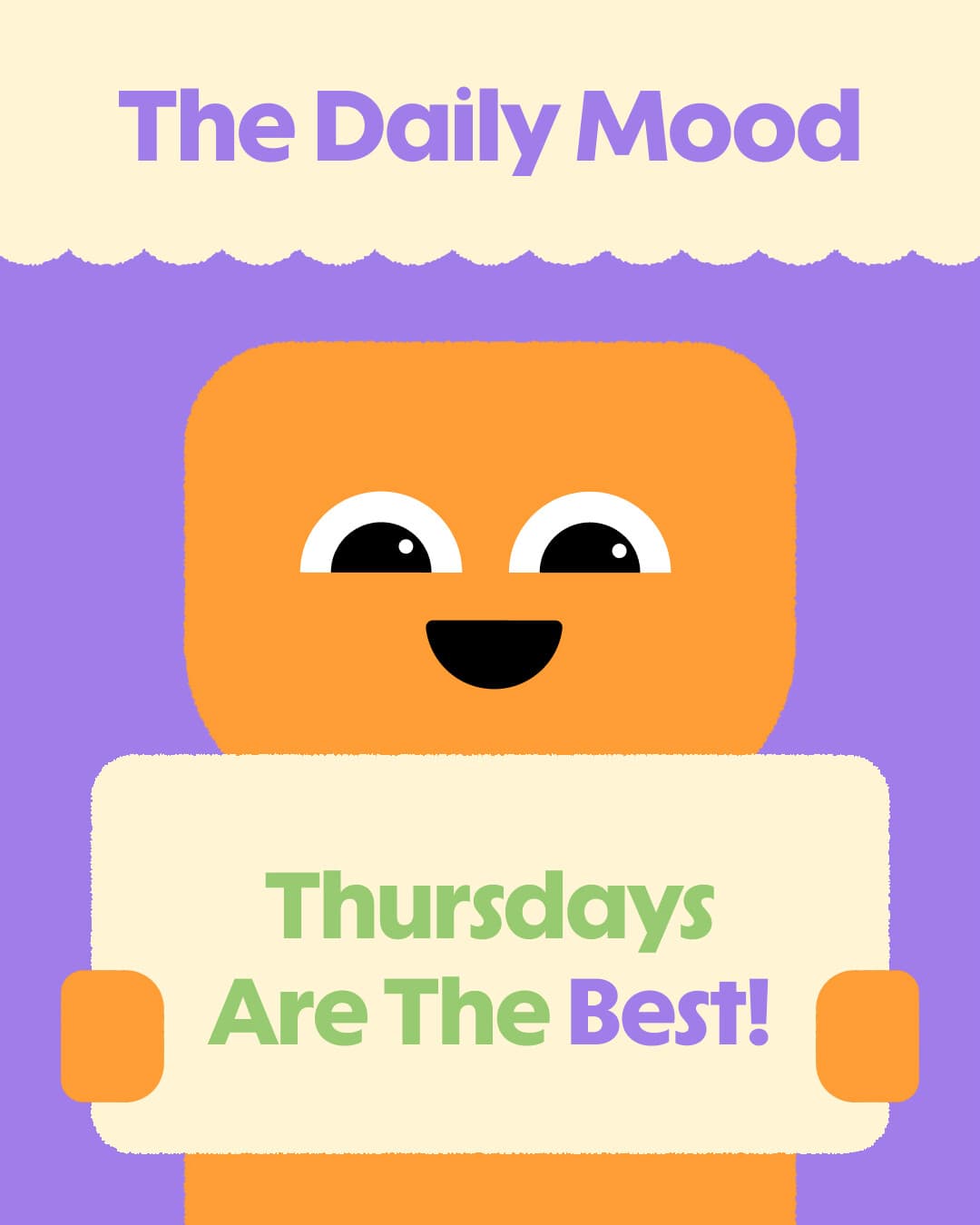
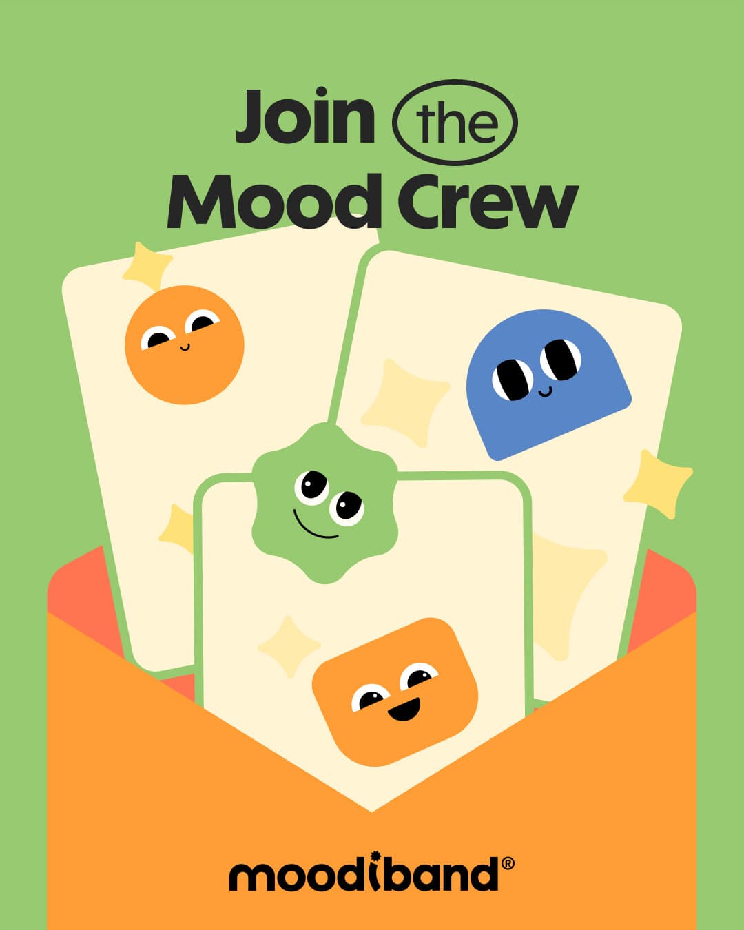
The proposal: the twelve covers in feed order.
Senior Designer | Branding · Motion · UX · AI Production